The morning of Navigium Isidis, which I celebrate by receiving presents. I am wearing my silk liberty print pajamas, a brown suede jaeger housecoat is draped over my shoulders, a saucer of champagne at my side. I open a present from my friend B—- wrapped in a gorgeous Hermes furoshiki wrap. A book slips out and I am transported 1,000s of years back.
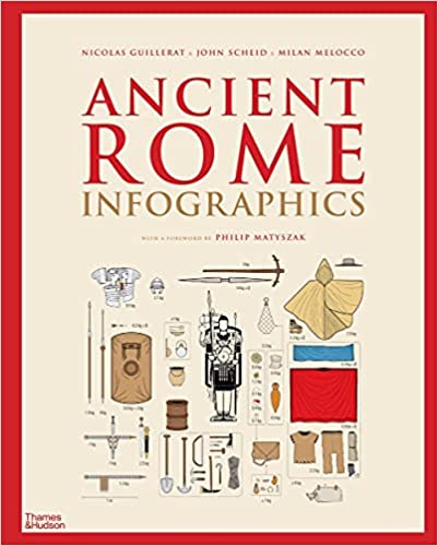
Ancient Rome: Infographics Hardcover by Nicolas Guillerat, John Scheid and others aims to make the complex history of “every aspect of the Roman world … clear and comprehensible to modern readers” through the medium of infographics. Infographics are a combination of data visualizations and other types of imagery to create compelling visual stories. Data visualizations are often grounded in quantitative data but all infographics – to some degree or the other – claim to be grounded in empirical fact. Like all ‘models’, visualizations simplify the data, removing noise and focusing on the clear trends.
We are in safe hands. Nicolas Guillerat is a talented graphic designer and data scientist. His images pop. Simple line drawings are giving a weight, complemented by an earthy palette. His maps and charts reveal a lot of information. They are simple, but not ‘simplistic’. The maps and illustrations of equipment are particular highlights.
The images are complemented with text written by John Scheid is an important historian of ancient religions. He argues on the centrality of the civic nature of Roman religion. This perhaps explains what for me feels like an over-centralized understanding of religion in some of the infographics, even if Schied has argued against such readings in earlier works. In one infographic Roman religion is split into ‘Public cults’ and ‘Private cults’. Private cults are then divided into homes and associations, the associations worshiping one specific Roman god or foreign god. Tell this to followers of Isis in Pompeii, where the temple was one of the first rebuilt after the earthquake or the Isis followers in Corinth whose festival was celebrated by the whole town. This is not a minor point.
You cannot understand Roman society and culture, unless you understand the cult of Isis.
It was popular across a vast swathe of the population and in many regions where it was seen as both ‘foreign’ and very much a ‘Roman’ religion. There are many passages of classical literature which mock the religion for its strange practices, but there is more evidence for coexistence.
The separation of Roman and Foreign reflects how historians organize their sources, but not necessarily how ancient people thought or acted. What did it mean for example, for a ‘Greek’ to worship an ‘Egyptian’ god in a ‘Roman’ city in a ‘Celtic’ province? These taxonomies can break down under the smallest amount of pressure. Infographics rely on a certain precision which is allusive for much of ancient history.
This is a genuinely fascinating book. You can pore over the intricate details for hours. It also got me thinking a lot about visual reconstructions of ancient societies.
“These fragments I have shored against my ruin”
I was reminded of these lines written by TS Eliot in The Waste Land, published 100 years ago. I read them as suggestive of a moment of crisis, when what Matthew Arnold called “the grating roar … melancholy, long, withdrawing” was silenced by modernity. Among other things this entailed a new way of looking at history.
For a long time, we interpreted the past through the prism of loss, or decline. The magical interpretations of Athanasisus Kircher, Gibbon’s Decline and Fall or Piranesi’s colossal ruins are all examples of this.
This approach is problematic as it makes ancient societies or cultures aspirational. As someone who studies ancient history, I would argue there is much to admire in their cultural remains, much that still fascinates. Yet we must always show a rigor in our analysis and awareness of what this evidence does and does not tell us about both the past society and today.
Infographics have a certain clinical sterility. They feel mathematical and precise, avoiding the emotional pull of the usual evidence for ancient history like literary texts or visual images. They make sense out of messy evidence, smoothing out the rough edges which creates compelling images but can be simplistic.
Yet what is ancient history built on but fragments: those alluring but sometimes problematic images, the grand architectural ruins, broken inscriptions or fragmented papyrus. Ancient historians have worked hard to analyze this evidence in order to understand past societies. Yet behind much ancient history lies scholarly debate which is often hidden behind the need for narrative drive in popular history. For me the scholarship is itself fascinating and I think if done well can be the focus. (If done badly you can end up with ancient aliens).
As I read this book, I couldn’t help but wonder is there a way to design infographics which center on scholarly disputes?
There’s a lot we can take from the field of Angonistic design. Agnonism is a political theory that foregrounds conflict. As Helena Kraff writes ‘Agonism is often described as a means for designers and citizens to reveal and contest hegemonies in society’. Examples include infographics which map the cost of prisons and the number of incarcerated people into neighborhoods.
How would such infographics work in ancient history?
Perhaps it might visualize the provenance of archaeological evidence, rooted as much of it is within colonialism and neo-colonialism. Or map alternative architectural reconstructions.
Infographics have the power to reveal hidden trends or clarify obscure theories. Ultimately however, if we are able to create compelling images which challenge the history of the field, their success must not be measured on the page or screen, but beyond…
